
Most SaaS founders watch qualified prospects visit their website, browse their features, maybe even check out pricing – then leave without taking any action. It’s frustrating, especially when you know your product could genuinely help them.
Exit intent popups offer a simple way to respectfully engage visitors who are already on their way out. Rather than interrupting someone’s browsing experience, these popups only appear when someone is about to leave anyway.
The concept is straightforward: if someone’s leaving your site, why not politely ask if there’s anything you can help with or offer something valuable before they go?
This guide examines real examples from actual SaaS companies and breaks down why certain approaches work better than others. The goal is giving you practical strategies you can adapt for your own business.
In this comprehensive guide, you’ll discover:
- 6 real SaaS exit intent popup examples and why they work
- Psychology principles that make visitors more likely to engage
- Practical implementation steps you can start today
- Common mistakes that hurt rather than help conversions
- Honest insights about what works (and what doesn’t)
Why Exit Intent Popups Feel Less Intrusive Than Regular Popups
Think about your own browsing behavior. When a popup appears while you’re trying to read something, it’s annoying – you have to close it to continue. But when you’re already moving your cursor to leave a site, a popup feels different. You were leaving anyway, so it’s not interrupting anything.
The timing makes all the difference:
- Regular popups: Interrupt what you’re doing
- Exit intent popups: Appear when you’re already done
Why people respond to exit intent:
- No pressure: You were leaving anyway, so engaging feels optional
- Last chance appeal: “Since you’re going, maybe this would interest you”
- Helpful framing: Often presented as assistance rather than sales
This isn’t about manipulating anyone – it’s about providing value at the right moment. If someone’s genuinely not interested, they can simply continue leaving. But if there’s something that might help them, this gives you one chance to mention it.
Research shows exit intent popups typically perform better than timed popups because they respect user behavior rather than fighting against it. When implemented thoughtfully, they can help SaaS companies connect with prospects who would otherwise leave without any engagement.
Ready to see how this works for your SaaS? Schedule a free strategy discussion to explore exit intent for your business →
6 Real SaaS Exit Intent Popup Examples
Example 1:
The Identity Transformation Approach
Company: StartStartUp (KlickFlow Client)
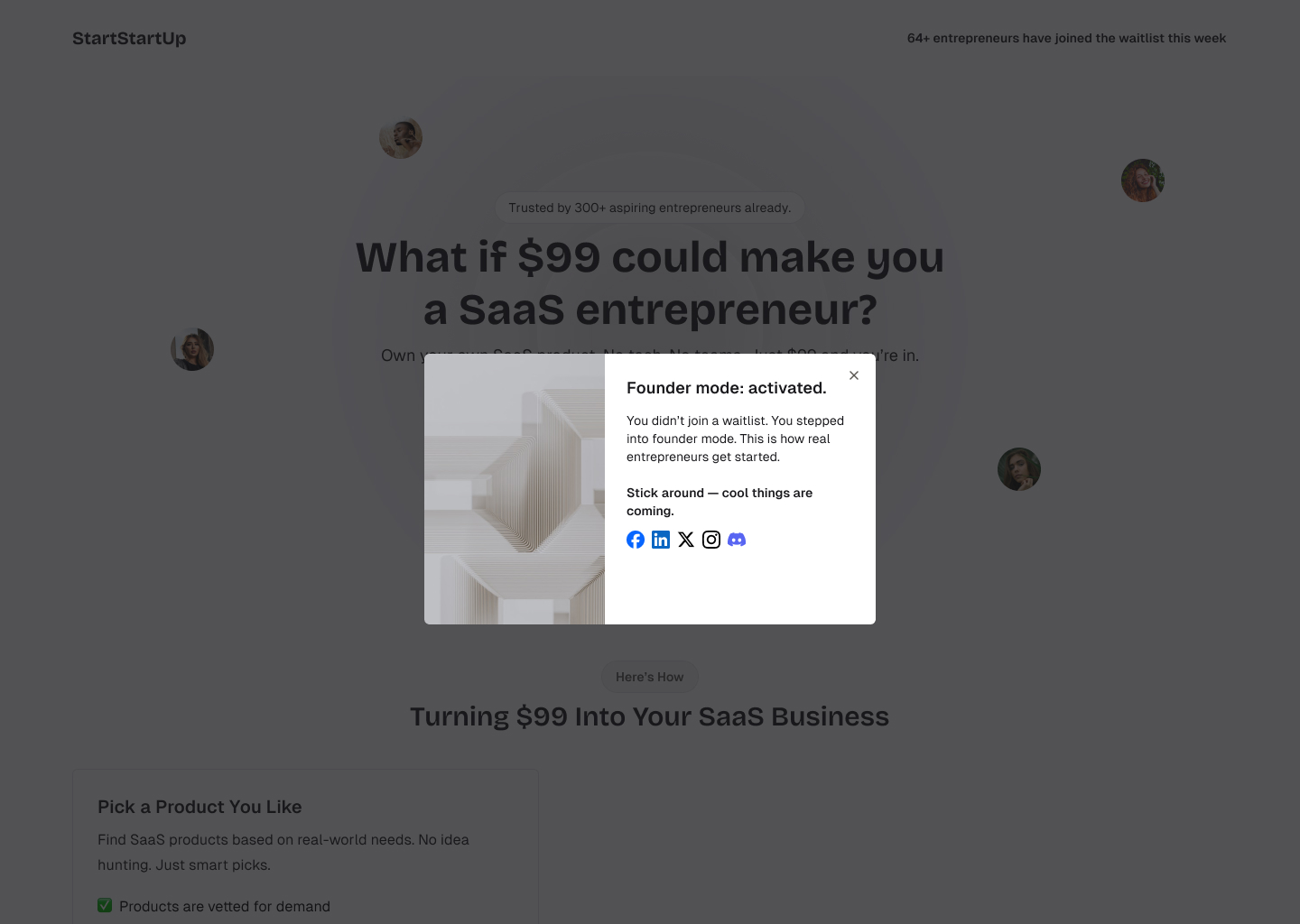
Strategy: Transform visitor identity from “prospect” to “founder”
What makes it work:
- Identity shift: “Founder mode: activated” – makes joining feel like an achievement
- Reframes the action: “You stepped into founder mode” vs. “joined a waitlist”
- Social proof: “This is how real entrepreneurs get started”
- Future anticipation: “Cool things are coming”
Why this works: Instead of feeling like they’re being sold to, visitors feel accomplished – they became entrepreneurs just by engaging. The language focuses on identity (“you’re thinking like a founder”) rather than product features.
Example 2:
The Dream Visualization Strategy
Company: Travel Hotline (KlickFlow Client)

Strategy: Visual destination imagery with personal aspiration
What makes it work:
- Emotional headline: “Don’t Leave – Your Dream Vacation Awaits!”
- Visualization trigger: Stunning destination photo
- Personal connection: “Your next vacation could look like this!”
- Low commitment: “Plan it in just a minute”
- Trust signal: “Spam-Free Guarantee”
Why this works: The beautiful destination image helps visitors imagine their goal rather than focusing on the booking process. Emotional imagery connected to the visitor’s actual desire (the vacation, not the booking platform) drives engagement.
Example 3:
The Problem Acknowledgment + Solution Approach
Company: OptinMonster

Strategy: Acknowledge the abandonment behavior while offering immediate solution
What works:
- Immediate recognition: “Ouch – That’s Abandonment!” – directly acknowledges what just happened
- Normalizing behavior: “Over 70% of visitors do just that” – removes shame from leaving
- Emotional reframe: “Don’t let anything stop you” – positions tool as empowerment
- Significant incentive: “60% off” creates substantial value
- Trust building: Multiple social proof elements reduce risk
- Pressure valve: “I have a few questions first” option reduces commitment anxiety
Why this works: Acknowledges leaving as normal behavior (“70% do this”), validates it without judgment, then immediately offers a compelling solution backed by social proof. This approach addresses visitor concerns directly rather than ignoring them.
Want to see how acknowledgment psychology could work for your SaaS? Get a free popup strategy session →
Example 4:
The Product Experience Invitation
Company: Zendesk

Strategy: Offer hands-on product experience instead of just information
What works:
- Action-oriented headline: “Take Zendesk for a drive” – implies test driving, not commitment
- Value-focused messaging: Shows how solutions bring ease to customer experience
- Visual product preview: Dashboard screenshot shows actual interface
- Low-commitment CTA: “Show me a demo” – easier than “start trial” or “buy now”
- Contextual timing: Appears on pricing page when people are evaluating costs vs. value
- Clean, professional design: Matches brand aesthetic without feeling intrusive
Why this works: Shifts the conversation from price (where they were about to leave) to product value. Instead of pushing for a sale, it offers a “test drive” experience that lets prospects visualize themselves using the solution.
Example 5:
The Exploration Invitation
Company: Xero

Strategy: Frame trial signup as discovery journey rather than business commitment
What works:
- Value-first approach: “Ready to explore?” – positions trial as discovery, not commitment
- Feature preview: “Dive into Xero’s features free for 30 days” – emphasizes exploration
- Confidence building: “Confidently choose the perfect plan” – removes decision pressure
- Low barrier entry: Free trial with clear next steps
- Visual storytelling: Phone with invoice imagery shows actual product value
Why this works: Instead of feeling like they’re being sold to, visitors feel invited to explore. The “Ready to explore?” framing transforms the trial signup from a business commitment into a discovery journey, reducing friction and increasing engagement likelihood.
Example 6:
The Helpful Assistance Approach
Company: Zoho CRM

Strategy: Helpful assistance with product discovery
What works:
- Helpful framing: “Can’t find what you’re looking for?” – positions as assistance, not sales
- Proactive support: “Let us know what you need – we’re happy to help!” – genuine helpfulness
- Clear next step: “REQUEST A CALLBACK” – specific, low-pressure action
- Visual trust: Professional representative image builds human connection
- Product guidance: Shows specific solutions based on different needs
Why this works: Instead of feeling abandoned or pressured, visitors feel supported. The “can’t find what you’re looking for” approach transforms departure into an opportunity for personalized assistance, making visitors feel valued rather than targeted.
Interested in implementing a helpful assistance approach? Schedule a free consultation to discuss what might work for your SaaS →
The Psychology Behind Effective Exit Intent Popups
Perfect Timing Psychology
Exit intent popups work because of when they appear, not just what they say. The timing leverages several psychological principles:
No Disruption The visitor was already leaving, so the popup doesn’t interrupt their intended action. This eliminates the psychological reactance (resistance) that people feel when their browsing is interrupted.
Last Chance Appeal Humans naturally respond to “final opportunity” scenarios. When someone’s leaving, presenting one last option feels appropriate rather than pushy.
Behavioral Pattern Break The popup interrupts the automatic behavior of leaving, creating a moment where visitors might consider an alternative action they hadn’t thought of.
Loss Aversion in Action
People generally dislike losing something more than they like gaining something equivalent. Exit intent popups can tap into this by:
- Framing the popup as preventing a loss (“Before you leave…”)
- Highlighting what they might miss out on
- Creating mild scarcity or time-sensitivity
However, this needs to be done authentically. Heavy-handed “Don’t miss out!” messaging often backfires because it feels manipulative.
Visualization and Emotional Connection
The most effective exit intent popups help visitors imagine a positive outcome:
- Travel Hotline: Shows the dream destination
- Zendesk: Shows the actual product interface they’d use
- StartStartUp: Helps visitors see themselves as founders
When people can visualize themselves benefiting from your offer, they’re more likely to engage.
Getting Started With Exit Intent Popups
Step 1: Start Simple
Before building something complex, test a basic version. Most exit intent tools let you create a simple popup in 10-15 minutes. Start there and improve based on what you learn.
Step 2: Focus on One Clear Goal
- If you want email subscribers: Offer something genuinely valuable (guide, template, etc.)
- If you want trial signups: Remove as much friction as possible
- If you want demo bookings: Make it feel consultative, not sales-heavy
Step 3: Write Like You’re Helping a Friend
Instead of marketing language, write like you’re genuinely trying to help someone. “Before you go, this might be useful…” works better than “Don’t miss this amazing opportunity!”
Step 4: Test and Adjust
Your first version probably won’t be perfect. That’s normal. Try different messages, offers, and designs to see what resonates with your specific audience.
Common Exit Intent Tools for SaaS Companies
- Pros: Most features, excellent targeting options
- Cons: Higher cost, can be complex for beginners
- Best for: SaaS companies with dedicated marketing teams
- Pros: Good middle ground between features and price
- Cons: Fewer integrations than OptinMonster
- Best for: Growing SaaS companies wanting more control
Choose based on your budget and technical comfort level, not because one is universally “the best.”
What Usually Goes Wrong With Exit Intent Popups
Common Mistakes to Avoid
Overly Aggressive Messaging “WAIT! DON’T LEAVE!” feels desperate and pushy. Calm, helpful messaging works better.
Irrelevant Offers A 50% discount on annual plans when someone was just browsing your blog doesn’t make sense contextually.
Hard to Close If your popup is difficult to close, people will remember that negative experience, not your offer.
Mobile Unfriendly Many exit intent popups work poorly on mobile devices. Test your implementation across devices.
Too Many Options Asking people to choose between 3 different offers creates decision paralysis. Keep it simple.
When Exit Intent Popups Don’t Work
Exit intent popups aren’t magic. They work better for some businesses than others:
- High-consideration purchases: Work well because people often leave to think
- Impulse purchases: Less effective because timing isn’t usually the issue
- Very technical audiences: May find any popup intrusive
- Brand-sensitive markets: Aggressive popups can hurt premium positioning
Want to discuss whether exit intent makes sense for your specific SaaS? Schedule a free strategy conversation →
Real Implementation Timeline
Week 1:
Setup and Basic Testing
- Choose a tool and set up basic popup
- Create simple message focused on one goal
- Test across devices and browsers
Week 2-3:
Message Refinement
- Try different headlines and offers
- Adjust timing and targeting rules
- Monitor visitor feedback and behavior
Week 4+:
Optimization
- A/B test different approaches
- Refine based on actual conversion data
- Consider advanced targeting options
Realistic expectations: You might see some improvement in the first few weeks, but finding what works best for your audience usually takes 1-2 months of testing.
Frequently Asked Questions
What kind of results can we realistically expect?
It varies significantly based on your audience, offer, and implementation. Some businesses see meaningful improvement within a few weeks, others need more time to find what works. The key is starting with something simple and improving based on actual data from your visitors.
Will this hurt our user experience?
If done thoughtfully, exit intent popups shouldn’t negatively impact user experience since they only appear when someone’s already leaving. However, poor implementation (aggressive messaging, hard-to-close popups, irrelevant offers) can definitely create a bad impression.
How do we avoid seeming pushy or desperate?
Focus on being helpful rather than persuasive. Instead of “Wait! Don’t leave!” try “Since you’re browsing [topic], this might be useful…” The tone and offer matter more than the technology.
Is this worth the effort for a small SaaS?
Exit intent popups are relatively quick to set up and test. Even if they only help you connect with a few additional prospects each month, that could be valuable for a growing SaaS. Start simple and see if it’s worth expanding.
How do exit intent popups work on mobile?
Mobile exit intent is less precise than desktop (no cursor tracking), but it can still work through scroll-based and navigation-based triggers. The key is ensuring your mobile popup design is thumb-friendly and easy to close.
Should we use exit intent popups on every page?
Not necessarily. They often work best on high-traffic pages where people are evaluating your product (pricing pages, feature comparisons, blog posts). Avoid using them on pages where people are already taking action (checkout, signup forms).
Ready to Try Exit Intent for Your SaaS?
Exit intent popups aren’t magic, but they’re a straightforward way to engage people who are already leaving your site. If implemented thoughtfully, they can help you connect with prospects you’d otherwise never hear from again.
If you’d like help thinking through an exit intent strategy for your specific SaaS, KlickFlow offers free strategy sessions. There’s no pitch or pressure – just a conversation about what might work for your business.
What these sessions typically cover:
- Looking at your current website visitor behavior
- Discussing what type of exit intent approach might fit your audience
- Talking through implementation options that match your resources
- Answering any questions about the process
The consultation is completely free with no sales pressure.
Schedule Your Free 30-Minute Strategy Discussion →
Not ready for a call? Connect with KlickFlow on LinkedIn where the team shares practical SaaS growth insights: Follow KlickFlow on LinkedIn →
